Oops! Something went wrong while submitting the form.
Built for companies ready to scale
'We want to revamp our About Us page but have no idea where to start.' That question came from a SaaS team during a webinar but we hear it from businesses of every size. This guide answers it with nine annotated Best About us Page Examples For Design Inspiration examples and, for each one, a final verdict: who it's best for and exactly what Buzz Interactive US can build for you based on that approach.
Why Your About Us Page Is a Business Asset
An about us page examples to connect with customers is where visitors decide whether to trust you. It sits at a critical point in the buyer journey, visitors have already found you, but they haven't yet committed. A strong About page tips that balance.
59%
of consumers are more likely to buy from a brand they trust
79%
of Gen Z consumers prioritise brand trust before purchasing
82%
of B2B buyers have a preferred vendor before first contact
The Buzz Interactive US approach:
We don't just design About Us pages, we build them to convert.
Every Buzz Interactive US About page is built on Webflow,
custom-designed to your brand, and optimised for Core Web Vitals.
The result: a page that ranks, loads fast, and earns trust from the first scroll.
The 6 Essential Components
Every high-converting About Us page contains these six elements , in some combination and order that fits your business type.
Brand Story / Origin
How you started, why you started it, and what problem you set out to solve.
Mission & Values Statement
A 1–2 sentence declaration of what your business stands for.
Team Introduction
Real photos + names. Users trust images of real people 20% more than stock photos.
Why you, not your competitors? What makes your approach different?
Call to Action (CTA)
One clear next step: book a call, view portfolio, get in touch.
9 Best About Us Pages: Annotated + Final Verdicts
For each example below, we've analysed the specific design and copy decisions that make the page work and added a Final Verdict: who the style suits, and what Buzz Interactive US can build for you using that approach.
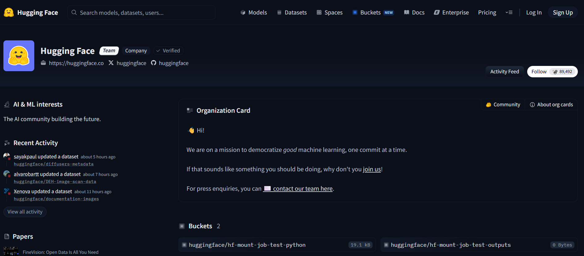
1. Hugging Face: Tech/AI Community Platform
Hugging Face is an open-source AI community where model demos, datasets, and research are shared publicly. Their About page is a live dashboard of community activity: dynamic, technical, and constantly updated.
Real-time activity feed: 'Person X uploaded a model 4 hours ago' makesure to always current, never stale
Community-first framing: members are positioned as the product, not the company
Spaces (Groups) let visitors explore topic communities directly from the About page
Gradient colour palette and coding-platform aesthetic mirror the technical product identity
Takeaway: If you serve a community or user base, surfacing real activity builds credibility without requiring testimonials or case studies
FINAL VERDICT #1: Hugging Face
Best for:
Tech platforms, SaaS communities, developer tools, AI companies,
or any brand whose value comes from active user participation.
What Buzz Interactive US can build:
A dynamic Webflow CMS-powered About page with live or auto-updating
content feeds, community member grids, and real-time activity sections —
no manual updates needed.
Implementation approach:
Webflow CMS Collections + API integrations to surface live data.
Custom grid layouts with animated entry points. Dark gradient aesthetic
matching technical brand identity.
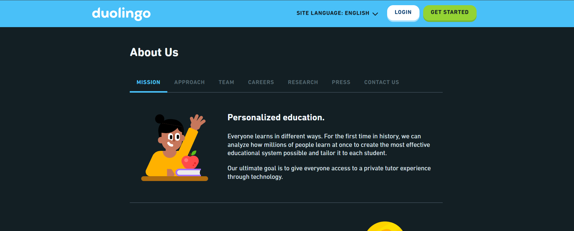
2. Duolingo: EdTech/Consumer App
Duolingo makes language learning free and addictive. Their About page is a masterclass in brand consistency, every design choice reinforces the same feeling as the app itself: playful, approachable, and energetic.
Primary brand green used consistently across the entire page
Custom illustrations instead of photography reinforce the playful, modern identity
Casual typography matches the app's lesson tone, casual but clear
Mission statement ('Free language education for everyone') is visible within 3 seconds of landing
Takeaway: Brand consistency between your About page and your product builds trust. If your product has a distinct feel, your About page should feel the same, not like a corporate brochure.
FINAL VERDICT #2 Duolingo
Best for:
Consumer apps, EdTech platforms, subscription services,
wellness brands, or any business targeting younger audiences
where personality is a competitive advantage.
What Buzz Interactive US can build:
A custom illustration-led About page with animated characters,
scroll-triggered interactions, bold brand colour usage,
and a conversational copy structure built to feel like
an extension of your product.
Implementation approach:
Webflow Interactions for scroll-based animations.
Custom SVG illustrations integrated into the layout.
Global colour variables ensuring total brand consistency
across every element.
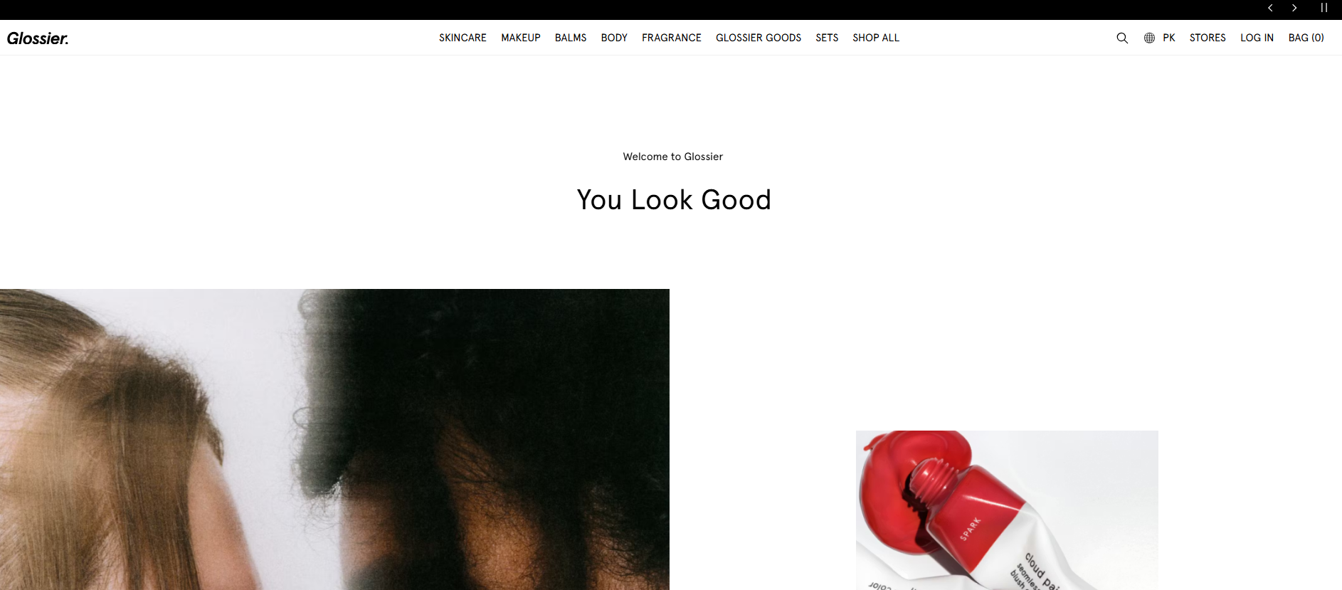
3: Glossier: Beauty/DTC Brand
Glossier championed 'skin first, makeup second.' Their About page embodies the brand's philosophy: minimal, personal, and aesthetically precise.
Clean layout with generous white space: the page breathes, it doesn't overwhelm
Storytelling leads over product features, you understand the 'why' before the 'what'
High-quality lifestyle photography balances text and creates emotional connection
Soft pastel palette aligns perfectly with product aesthetic identity
Takeaway: For brands with strong visual identity, the About page should live in that world. Lead with purpose before product.
FINAL VERDICT #2 Duolingo
Best for:
Consumer apps, EdTech platforms, subscription services,
wellness brands, or any business targeting younger audiences
where personality is a competitive advantage.
What Buzz Interactive US can build:
A custom illustration-led About page with animated characters,
scroll-triggered interactions, bold brand colour usage,
and a conversational copy structure, built to feel like
an extension of your product.
Implementation approach:
Webflow Interactions for scroll-based animations.
Custom SVG illustrations integrated into the layout.
Global colour variables ensuring total brand consistency
across every element.
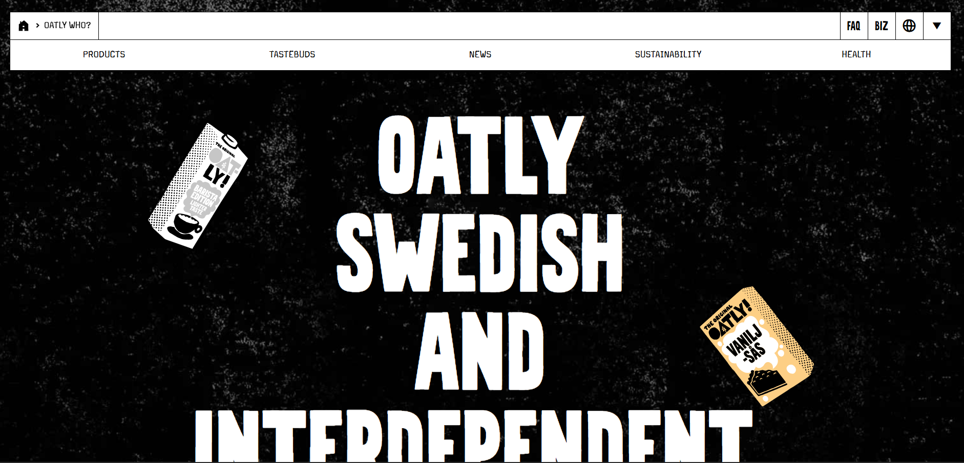
4. Oatly: Food & Beverage/Sustainability Brand
Oatly is a Swedish oat-based food company with a brand voice that's become an industry benchmark for personality. Their About page doesn't read like corporate copy, it reads like a letter from a friend.
Conversational, humorous tone throughout, it's disarming and instantly differentiated
Bold, varied typography creates visual interest without relying on photography
Minimalist black-on-white palette aligns with packaging and broader brand identity
The page leads with values and mission, product comes considerably later
Takeaway: Personality in copy is a competitive advantage that templates can't replicate. Write how your best salesperson talks, not how a press release reads.
FINAL VERDICT #4 Oatly
Best for:
Food and beverage brands, sustainable product companies,
B-Corps, or any business with a bold brand voice and a mission
worth leading with. Especially effective for challenger brands
taking on established categories.
What Buzz Interactive US can build:
A bold-typography About page with variable font sizing,
editorial layout inspired by print design, humorous micro-copy,
and a mission-first narrative structure that positions your brand
as a category alternative worth choosing.
Implementation approach:
Webflow's typography controls for variable heading sizes
and deliberate font pairing. Custom CSS animations on key copy moments.
Black-and-white baseline palette with single accent colour for emphasis.
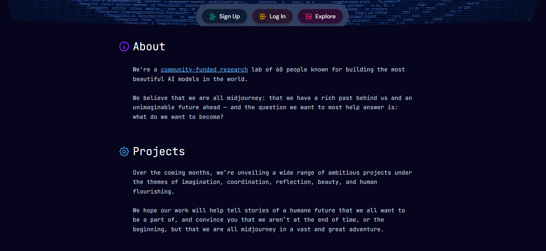
5. Midjourney : AI/Creative Tool
Midjourney is an independent AI research lab. Their About page visually communicates what the tool does before a single word is read: immersive, futuristic, and immediately distinctive.
Deep colour palette (black, navy) creates a premium, futuristic atmosphere
Neon accent colours (blues, purples) add a visual signature that feels native to AI
Minimal copy: the page trusts its visuals to carry the brand story
Clean modern typography in white on dark, maximum contrast, maximum readability
Takeaway: Your About page's aesthetic should preview the product experience. Ask: does our page feel like our product?
FINAL VERDICT #5 Midjourney
Best for:
AI companies, creative software tools, gaming studios,
cybersecurity firms, or any tech brand where the product itself
is visually powerful and the About page should feel like proof
of that power.
What Buzz Interactive US can build:
A dark-mode Webflow About page with full-screen immersive sections,
animated gradient backgrounds, neon accent details, and a minimal
copy structure that lets the visual design carry the brand narrative.
Implementation approach:
Webflow dark mode layout with custom background gradients and glow effects.
Full-viewport hero sections with scroll-triggered transitions.
Canvas or Lottie animations for ambient movement without performance cost.
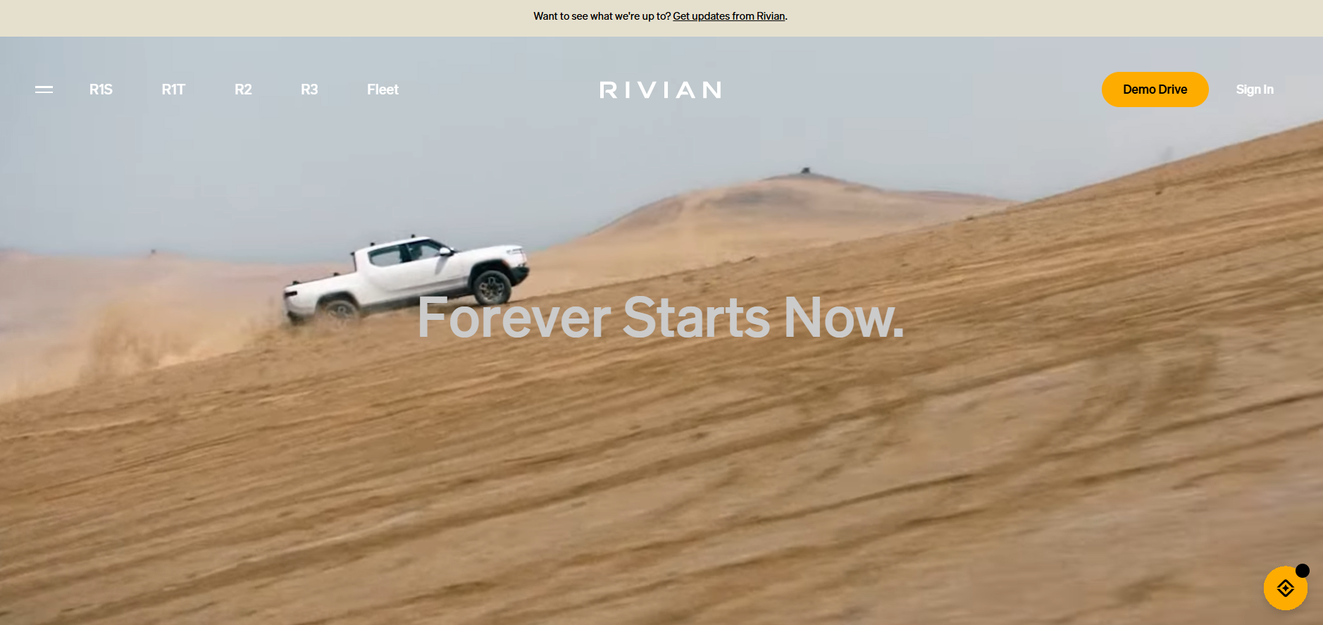
6. Rivian: Automotive/Electric Vehicles
Rivian builds electric adventure vehicles. Their About page positions them not as a car company but as a mission-driven movement, for people who believe exploration and sustainability can coexist.
Full-width, high-resolution photography of vehicles in natural outdoor settings
Sequential narrative structure walks visitors through mission, values, and journey
Strong emotional storytelling: the page creates aspiration before consideration
Takeaway: If your business has a mission beyond profit, lead with purpose. Rivian works because it leads with 'why' not 'what'.
FINAL VERDICT #6 Rivian
Best for:
Sustainability-led brands, outdoor and adventure companies,
EV and clean technology businesses, B-Corps,
and any brand whose "why" is powerful enough
to be the primary selling point.
What Buzz Interactive US can build:
A cinematic Webflow About us page design with full-viewport
parallax photography, a scrollable mission-to-impact narrative,
earthy colour palette, and video integration,
designed to inspire before it informs.
Implementation approach:
Webflow's scroll interactions for parallax and reveal effects
on full-width imagery. Video background sections with fallback images.
Structured narrative layout with milestone timeline components
built in Webflow CMS.
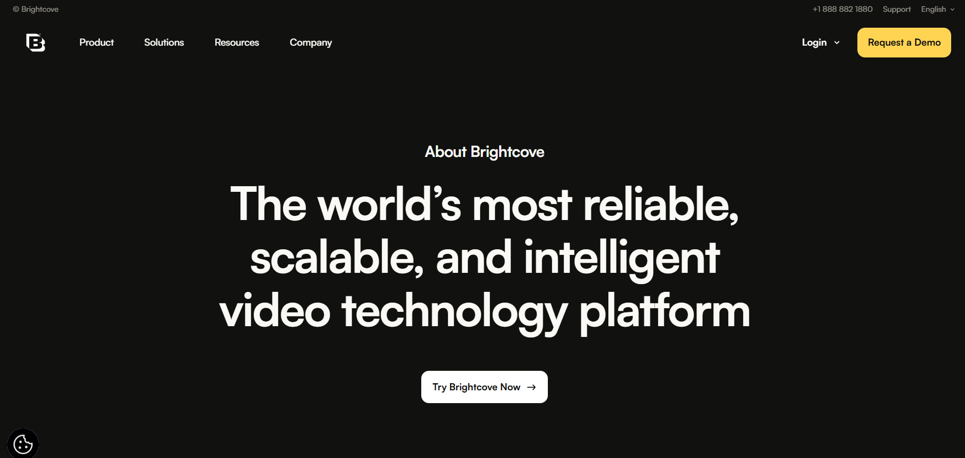
7. Brightcove: B2B SaaS / Video Platform
Brightcove is a video platform for enterprise content delivery. Their About page serves a professional B2B audience with a clean, credibility-led design, clarity over personality.
White background with strong typographic hierarchy, designed for scanning
Headings bolded to guide the eye; body text consistent in size and spacing
Subtle brand colour accents prevent monotony without distracting
Navigation is effortless, visitors find what they need in under 30 seconds
Takeaway: For B2B, clarity beats personality. Prospects want to quickly understand: what do you do, who do you serve, and can I trust you?
FINAL VERDICT #7 Brightcove
Best for:
B2B SaaS companies, professional services firms,
legal and financial businesses, enterprise technology brands,
or any organisation where buyers need to establish credibility
and trust before engaging.
What Buzz Interactive US can build:
A clean, conversion-optimised B2B About page with trust-signal sections
(client logos, certifications, metrics), clear typography hierarchy,
team grid, and a structured credibility narrative that answers
the buyer's implicit due-diligence questions.
Implementation approach:
Webflow layout with strict grid discipline, restrained colour palette,
and component-based design for easy content updates.
Client logo carousel, team grid with bio popups,
and social proof sections built in Webflow CMS.
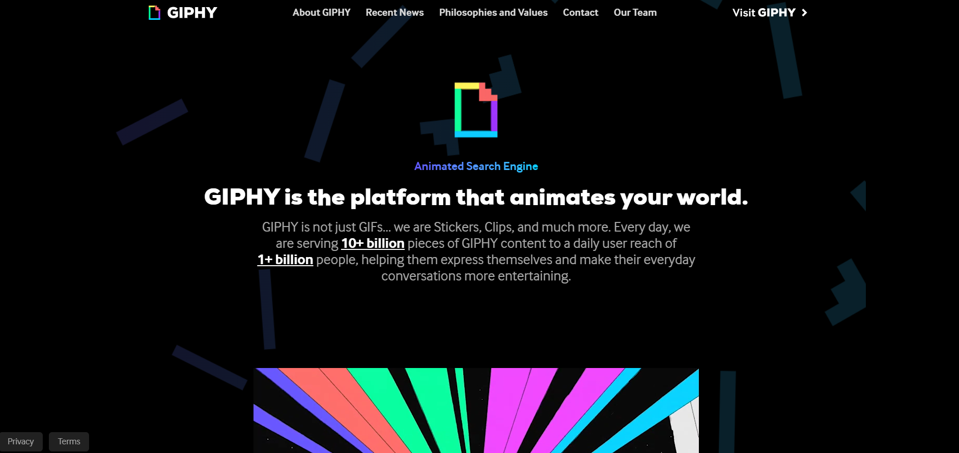
8. GIPHY: Consumer/Media/GIF Platform
GIPHY is the world's largest GIF platform. Their About page balances brand vibrancy with clean, scannable content, fun without being overwhelming.
Bold, vibrant logo and brand colours immediately reinforce recognition
Clean legible typography: headings bold, body text consistent and readable
Simple layout ensures visitors navigate quickly and understand the mission
Design mirrors the platform's personality: energetic but organised
Takeaway: Brand recognition starts with consistent colour. Make your visual signature immediately apparent, visitors should know whose page they're on within one second.
FINAL VERDICT #8 GIPHY
Best for:
Consumer media platforms, entertainment brands,
creator tools, social-first companies,
or any business whose brand identity is its primary differentiator
and where recognition is more valuable than formal credibility.
What Buzz Interactive US can build:
A vibrant, colour-led About page with bold brand expression,
animated logo section, mission statement block,
and a product/platform feature showcase,
designed to feel unmistakably like your brand
the moment it loads.
Implementation approach:
Webflow with custom brand colour application across every section.
CSS keyframe animations on logo and hero elements.
Clean typographic grid with bold accent colours
used strategically, not uniformly.
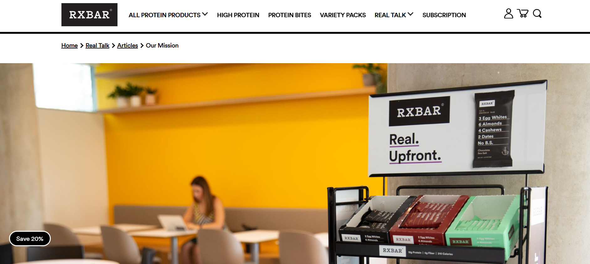
9. RXBAR: Food/Consumer Packaged Goods
RXBAR is a protein bar brand built on radical transparency, the ingredients are on the front of the pack. Their About us page content uses that same honesty as its entire design philosophy.
White background with bold text mirrors the brand's iconic packaging design
Founder story with real photography of the founders in their early days
No jargon: written for consumers, not investors, simple, direct, trustworthy
Deliberate white space: every element earns its place, nothing decorates for decoration's sake
Timeline imagery showing product evolution builds authentic brand history
Takeaway: If your brand has a real founding story, tell it with real photos. Authentic moments build more trust than polished studio imagery.
FINAL VERDICT #9 RXBAR
Best for:
CPG brands, food and drink companies,
health and wellness businesses, bootstrapped founders,
or any brand whose authenticity and origin story
is a genuine competitive advantage over larger,
more polished competitors.
What Buzz Interactive US can build:
A founder-story Webflow About page with timeline layout,
authentic photography integration, bold typographic pull-quotes,
ingredient or process transparency sections,
and a packaging-consistent design system
that turns brand values into page structure.
Implementation approach:
Webflow timeline component built with CMS
for easy milestone updates.
Large typographic quote sections.
Minimal, high-contrast layout using only 2–3 brand colours.
Photography placement optimised for mobile-first viewing.
About Us Page Examples & Why They Work: All 9 Examples
Final Verdicts — Buzz Interactive US Can Build This For You
Brand
Best For
Buzz Interactive Can Build
Verdict
Hugging Face
Ideal for tech/SaaS brands wanting a community feel
Dynamic real-time CMS feeds
Build This
Duolingo
Perfect for consumer apps and EdTech brands
Custom illustration-style animations
Build This
Glossier
Best for DTC beauty, fashion, or wellness brands
Luxury white-space & scroll effects
Build This
Oatly
Suits bold F&B or lifestyle brands with strong voice
Bold variable typography systems
Build This
Midjourney
Right for AI, creative tools, or gaming studios
Dark-mode immersive experiences
Build This
Rivian
Ideal for sustainability-led and outdoor lifestyle brands
Full-width cinematic hero sections
Build This
Brightcove
Great for B2B SaaS or professional services
Clean B2B trust-signal layouts
Build This
GIPHY
Great for media, entertainment, or consumer platforms
Vibrant brand colour showcases
Build This
RXBAR
Suits CPG, food, or any brand built on transparency
Founder story + timeline builds
Build This
About Us Page Strategy by Business Type
Service Business
(Agency, Consultant)
Lead with the founder's story
Show specific results/numbers
Team photos — real, not stock
3-5 client logos for credibility
CTA: "Schedule a free call"
Product / E-Commerce
(Food, Beauty, Lifestyle)
Product origin and "why it exists"
Behind-the-scenes imagery
Sustainability or values section
Press/media mentions if available
CTA: "Shop the collection"
SaaS / Tech
(Tools, Platforms, Apps)
Problem-first narrative
Founder or team credentials
Customer or user count as proof
Vision statement for the future
CTA: "Start free trial"
6 Common Mistakes and How to Fix Them
Mistake: Writing in third person all the way through
Fix: Use first-person “we” — it’s warmer and more authentic
Mistake: Using only stock photography
Fix: Real team photos increase trust by 20% over stock images
Mistake: No clear CTA at the bottom
Fix: Every About Us page should direct visitors to the next step
Mistake: Listing features, not values
Fix: Readers connect with purpose and story, not product specs
Mistake: Ignoring mobile responsiveness
Fix: 62.5% of web traffic in 2025 is mobile — design for it first
Mistake: Forgetting to update it
Fix: Stale team photos or outdated milestones damage credibility
About Us Page Launch Checklist
About Us Page Launch Checklist
✓
Brand origin story or founder narrative (150–400 words)
✓
Clear mission statement — 1 to 2 sentences
✓
Team section with real photos and names
✓
At least one trust signal: awards, press, client logos, or reviews
✓
Unique Value Proposition — why you, not a competitor?
✓
Primary CTA button (e.g. “Work with us”, “View our work”)
✓
Mobile-optimised layout tested on iOS and Android
✓
Page load time under 2.5 seconds (Core Web Vitals)
✓
SEO: Page title, meta description, and header tags set
✓
Consistent brand voice matching homepage and product pages
Tips for Your Small Business 'About Us' Page: Step-by-Step
Step 1: Define your reader before writing
Your About Us page is not for you: it's for your reader. Before writing, answer: Who arrives at this page? What are they deciding? A marketing director evaluating an agency has different needs from a first-time buyer deciding whether a skincare brand's values match theirs.
Step 2: Write your origin story
Start with the problem you set out to solve, or the moment you decided to start. Formula: 'We started [brand] because [specific problem]. After [journey], we built [solution]. Today, [impact].'
Step 3: Write your mission statement
One or two sentences that capture what you're working toward, not what you sell, but what you're building. Duolingo: 'Free language education for everyone.' RXBAR: 'No BS.' Oatly: 'We exist to make it easy for people to turn what they eat into personal moments of joy.'
Step 4: Introduce your team
Real names, real photos, and one-sentence descriptions. A team section turns a company into people and people are easier to trust than logos.
Step 5: Add 2–4 trust signals
Awards, press coverage, notable clients, years in business, customer count, certifications. Choose the 2–4 strongest, don't overload.
Step 6: Write your CTA
One clear next step matched to your business goal: 'Schedule a free consultation', 'View our portfolio', 'Start your free trial'. One CTA only multiple options create decision paralysis.
Tip: Aim for 300–600 words. The sweet spot is around 400–500 words — enough to tell the story authentically without losing attention. Buzz Interactive US can review your draft copy before build begins.
Work with Buzz Interactive US
Every example in this guide represents a design approach that Buzz Interactive US can build for you ,custom, on Webflow, optimised for performance and conversion. Whether you're inspired by RXBAR's founder authenticity, Midjourney's dark immersive aesthetic, or Glossier's editorial minimalism, we can translate that approach into a page that's distinctly yours.
Ready to Build Your About Us Page?
Buzz Interactive US specialises in custom Webflow design, we can implement any of the nine styles in this guide, built specifically for your brand, your audience, and your goals.
It depends on your industry and brand personality. For service businesses (agencies, consultants, freelancers), the RXBAR founder-story approach or Brightcove's clean B2B credibility layout are most effective. For DTC or lifestyle brands, Glossier's minimalist aesthetic or Oatly's bold personality-led approach convert well. Buzz Interactive US will advise on the right approach for your specific brand during the project brief.
Yes. All nine styles featured in this guide are within Buzz Interactive US's Webflow build portfolio. From Midjourney's dark immersive experience to Duolingo's illustration-led layout, each approach has been implemented for clients across different industries. The style is built custom for your brand, not adapted from a template.
For most small businesses, 300–600 words is the sweet spot. The optimal range from industry research is around 400–500 words are enough to tell your story authentically without losing the reader. Non-profits or brands with complex histories may justify 600–1,000+ words.
Research shows real photos increase trust 20% over stock images. Use real team photos, even smartphone photography is more credible than a library photo. Buzz Interactive US can advise on photography requirements during the project brief.
A standalone Inspiring 'About Us' Page Examples for Small Businesses build typically takes 2–4 weeks from approved brief to launch, including design, development, and a round of revisions. For pages built as part of a full website project, the About page is delivered as part of the overall timeline.
Yes. An optimised About page with your business name, location (for local SEO), team names, and service keywords helps search engines understand your brand. Strong pages also earn dwell time and backlinks (from press coverage), both positive ranking signals. Every Buzz Interactive US build includes on-page SEO setup as standard.
Ready to be different?
Thank you! Your submission has been received!
Oops! Something went wrong while submitting the form.
")


.svg "Upward index finger gesture icon")


